 01
01
Turning free trial users into loyal members
NeoTaste is a platform to discover restaurants, bars and cafés in major cities, mainly across Germany, with a growing presence in the UK, Netherlands, and Austria. Users get exclusive deals you can only find through NeoTaste. Partner venues use it to fill quieter tables and attract new customers.
Many users on trial were redeeming just one deal
NeoTaste runs on a subscription model. When users sign up, they enter their payment details and get a 30-day free trial. If they haven't cancelled by the end of it, they're automatically charged. That window is everything: it's the only time the product can prove its value before money changes hands.
Cohort data pointed to a clear pattern: a significant portion of trial users redeemed only one deal and didn't convert. Reaching a second deal was one of the main friction points in the funnel.
The business needed users to convert before their first payment. For users, the problem was simpler: one deal isn't enough to feel the benefit. How do we get new users to experience saving money when going out, often enough to see why NeoTaste is worth keeping?
I led the design, working closely with the UX Researcher, Data team, and PM.
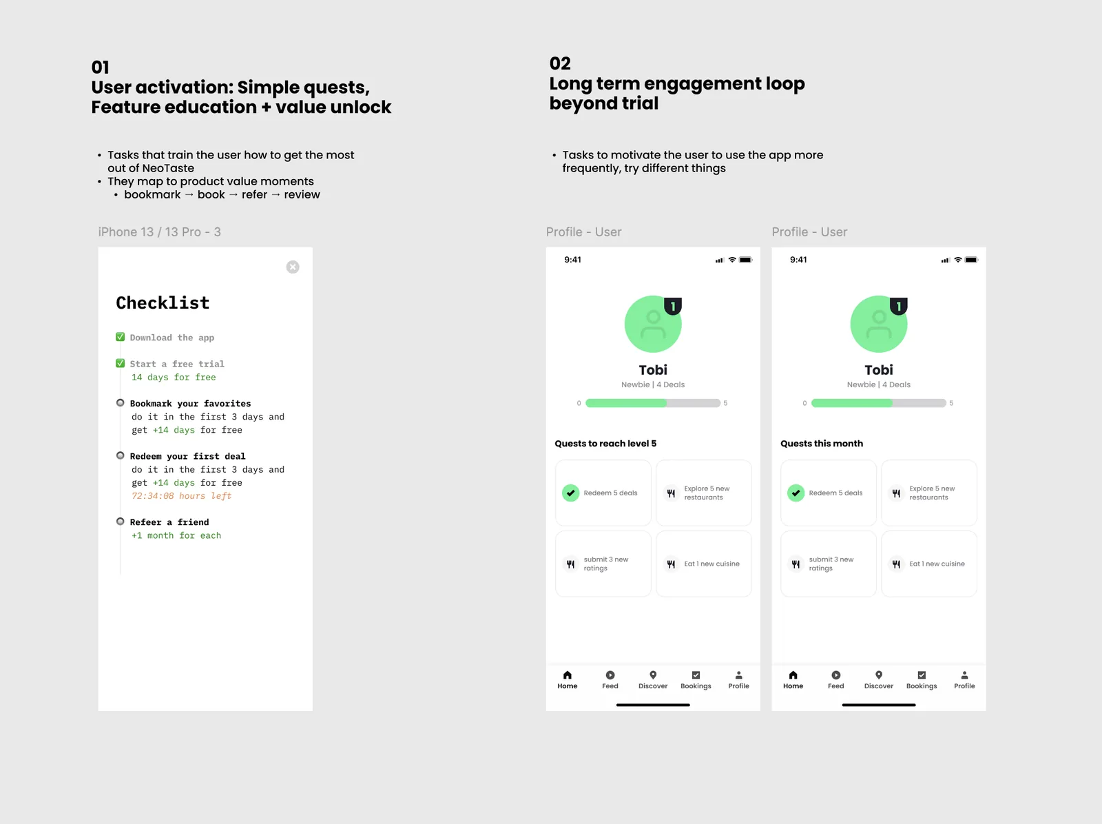
Why we dropped streaks and built a quest instead
The team's first instinct was gamification. Streaks, daily check-ins, Duolingo-style mechanics. The idea: reward users for opening the app every day, build a habit, and conversion would follow.
But the streak model fell apart quickly. It rewards the wrong thing: opening the app is not the same as using it. A user who forgets on day 29 feels punished after 28 days of effort, not motivated. Streaks create anxiety, not engagement. And for NeoTaste, where the value is in going to restaurants and redeeming deals, daily opens meant nothing.
Instead of engineering habits around app opens, we'd guide users toward meaningful actions, the ones that actually led to conversion. The data had already told us what those were.
Before bringing this direction to stakeholders, we used Gemini to pressure-test the framing: asking it to argue against the quest approach, surface patterns from similar products, and flag assumptions we might be taking for granted. It helped sharpen the hypothesis faster than a round of internal reviews would have.
Three workstreams, one direction
Concept validation
The UX Researcher ran an unmoderated Maze study with non-NeoTaste users, showing an early quest concept and probing task count, reward expectations, and habit-building behaviour.
Competitive analysis
I reviewed Mobbin and habit-building apps across categories, not just direct competitors, to identify onboarding patterns that actually work when guiding users into a new behaviour.
Cohort data
We requested a specific cohort analysis from the Data team to baseline trial-period behaviour before the quest shipped, so we'd have something real to measure against post-launch.
Gemini played a supporting role throughout this phase. We used it for quick qualitative exploration alongside the more structured workstreams: surfacing patterns, challenging assumptions, and getting fast directional answers in areas where a full user study was not needed. It worked well as a way to spot gaps and move faster between ideas worth testing and ones worth dropping.
To structure the quest, I mapped the activation flow. Every new user passes through the same stages: Sign-up, Set-up, Aha moment, Habit moment, Retention. The gap we needed to close was between the Aha and Habit moments, before the first charge landed.
We then looked at how other consumer apps handle this same challenge. From fitness to productivity tools, the pattern was consistent: guided onboarding that pairs education with small, meaningful actions. By the time users finish setup, they've already experienced the value.
Competitor onboarding research
Onboarding patterns from leading apps. All of them guide users through key actions early, before expecting any habit to form.
Taken together, the workstreams gave us what we needed to move forward with confidence: a baseline to measure against, a validated concept, a clear pattern of what works when building habits in consumer apps, and enough qualitative signal to feel good about the direction before committing to it.
Keeping the quest focused
The core team on this project was small: the PM, the UX Researcher, and me. We were aligned early on what the quest needed to do. The tension came from above.
Management wanted to include a "refer a friend" task inside the quest. The reasoning made sense from a business perspective: referrals are a growth lever, and the quest had a captive audience of new users who were already engaged. Adding it would have given the feature guaranteed exposure.
But including it meant either extending the quest to 6 tasks or removing one of the 5 we considered core to the activation flow. Neither felt right. A longer quest risked lower completion. Removing a core task meant compromising the very thing the quest was designed to do: get users to experience the app's real value before the trial ended. Referring a friend doesn't help you discover NeoTaste.
Rather than pushing back on instinct alone, we ran user tests. We put both versions in front of real users and looked at how they responded to the referral task in context. The results were clear: users found it out of place. It felt like the app was asking for a favour before it had earned one. The PM, researcher, and I presented the findings together, and management agreed to drop it.
Five steps to get new users to their first real win
The core question was: which 5 actions would most reliably take a new user from "interested" to "I get it now"? We mapped retention data against what leading apps teach users early, and landed on a clear sequence.
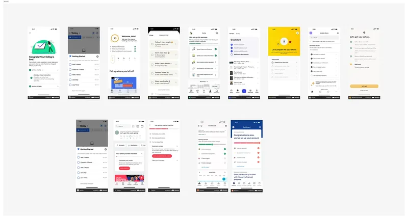
Before landing on the quest format, we explored several directions: 30-day challenges, circular progress rings, and checklist-style home screens. A lot of the rapid ideation in this phase happened in Figma Make, and we also experimented with Google Stitch despite it being in early beta at the time. Both were useful for getting rough ideas in front of the team quickly without spending time on polish. Here's a snapshot of what we iterated through.
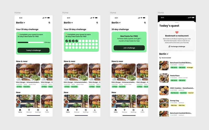
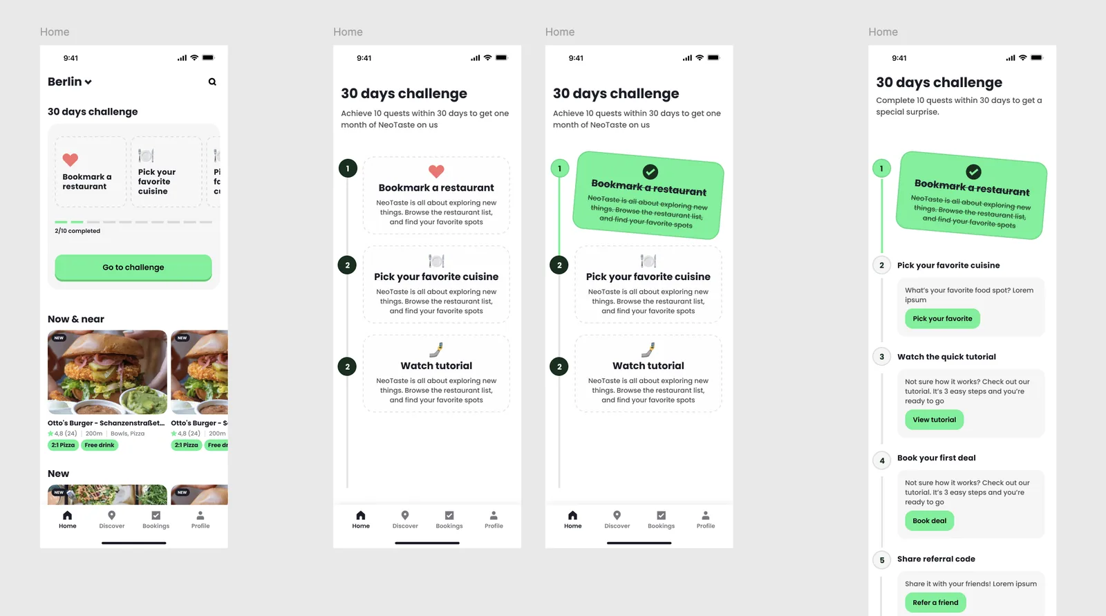
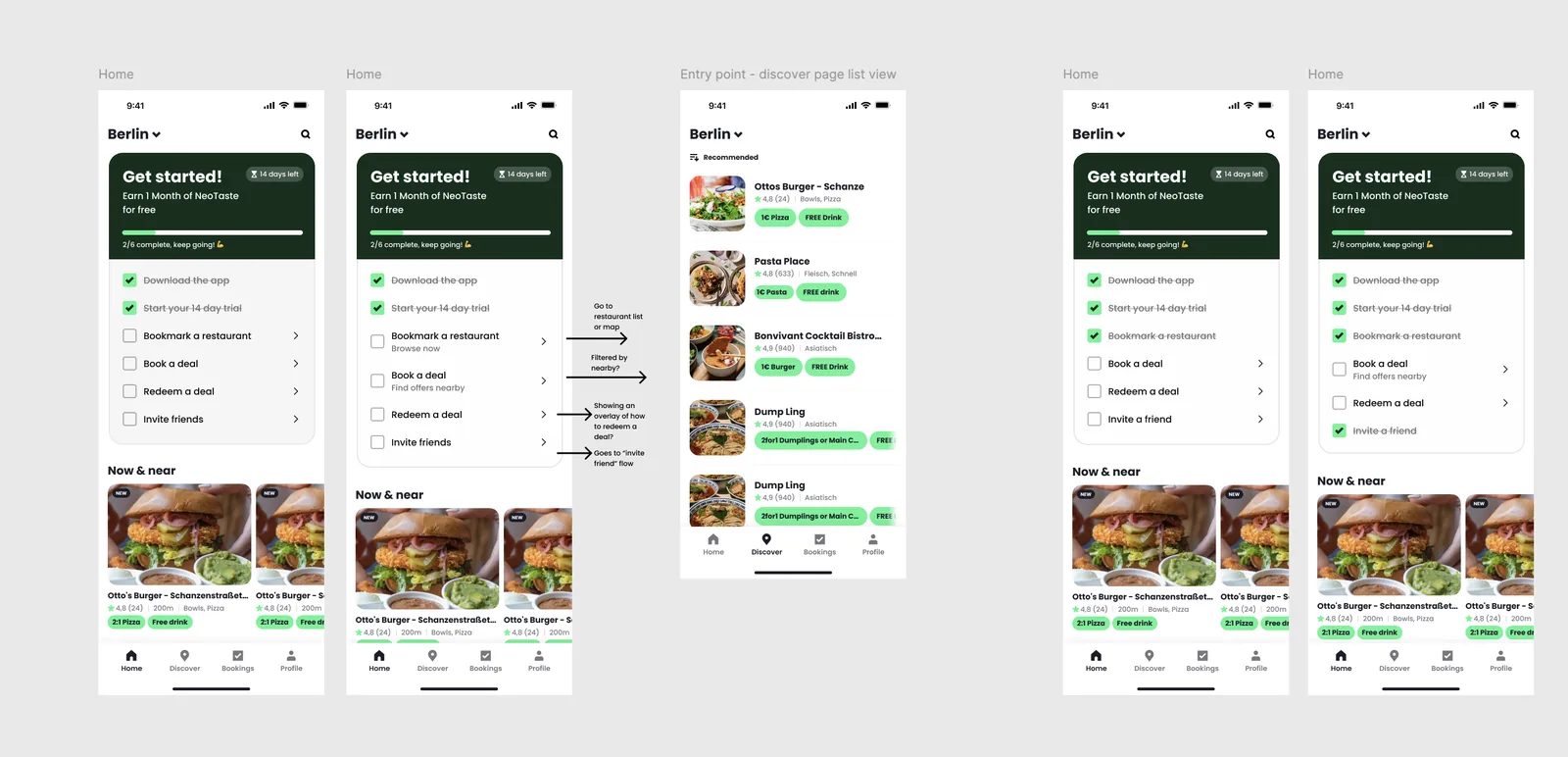
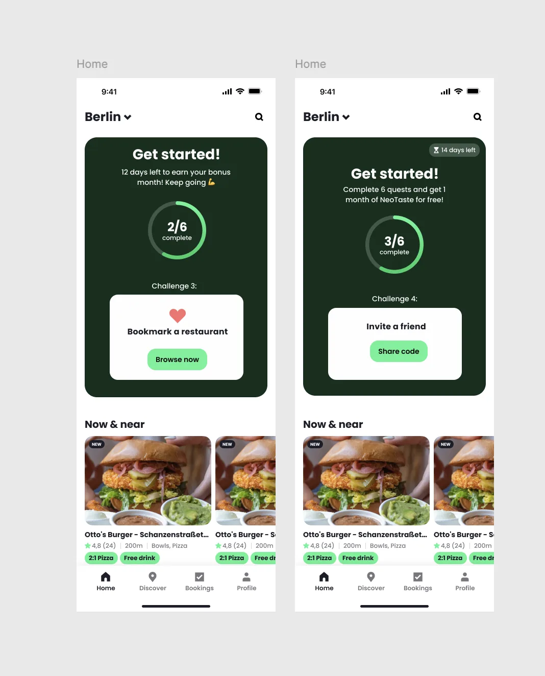
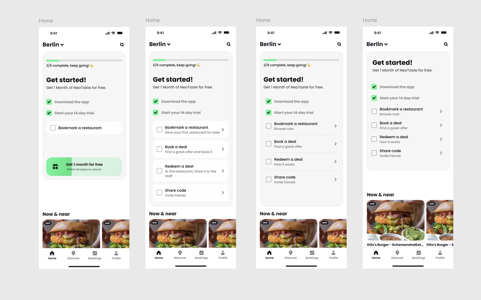
The key constraint that shaped the final direction: the quest had to work for users who wanted guidance without getting in the way of users who preferred to explore on their own. That ruled out anything that took up too much space or required upfront commitment, like 30-day challenges, timeline formats, or extended explanations. What remained was a compact, easy-to-ignore banner with a short task list. A progress bar to track completion and feel a sense of movement. Tasks that, when tapped, take you directly to where you can complete them. And copy that stays motivational without being pushy. The minimum needed to make the quest genuinely useful.
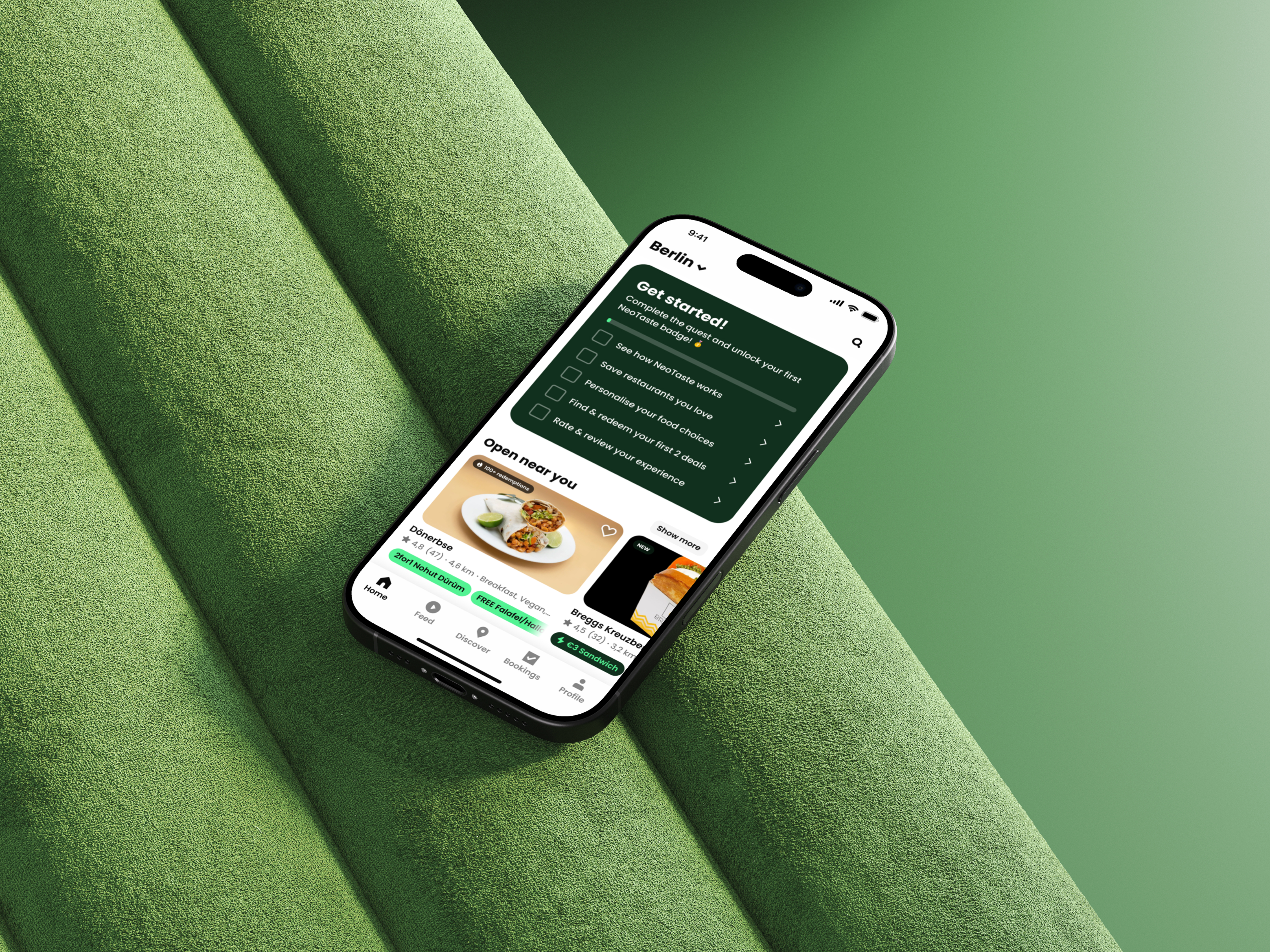
The quest lives on Home and is fully optional. Since Discover (the map view) is still the default screen, we added a floating entry point there to make sure users actually find it. It stays visible for 30 days. The quest is there to guide, not to block.
Each task was chosen because it maps directly to a moment in the activation flow, from understanding how the app works to redeeming a first deal and building a habit around it.
The design solution
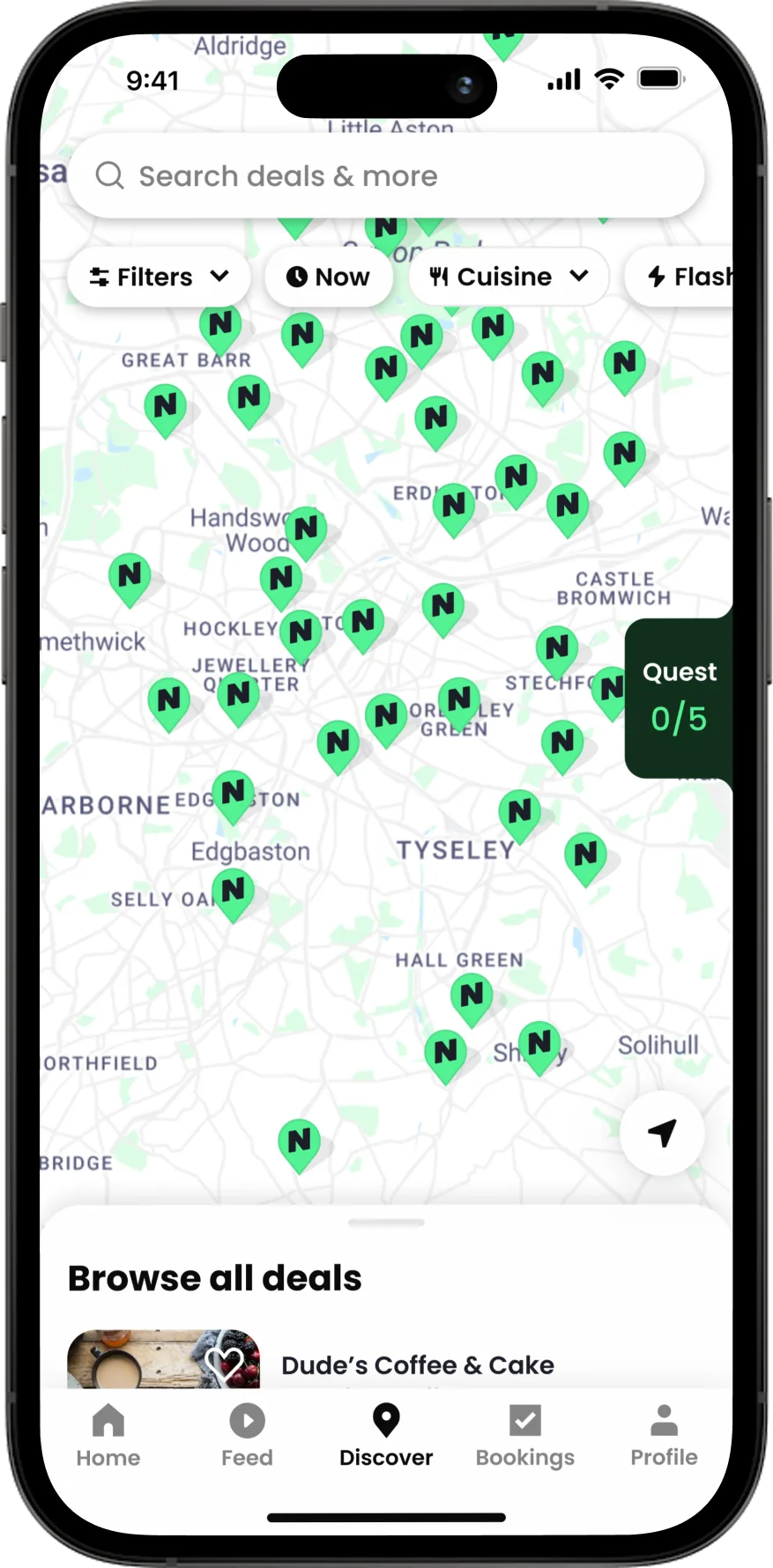 Floating entry point on Discover (map view)
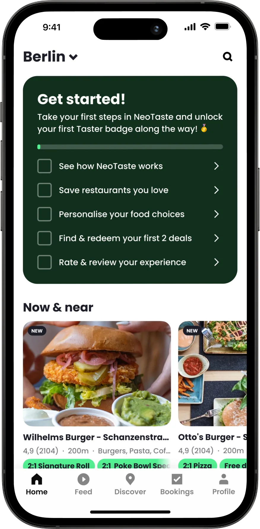 Quest view: first time, tasks not yet started
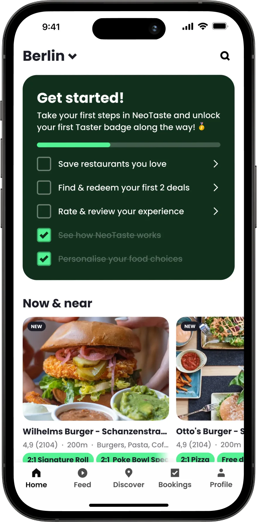 Quest view: returning user, tasks in progress
 Quest view: all 5 tasks completed
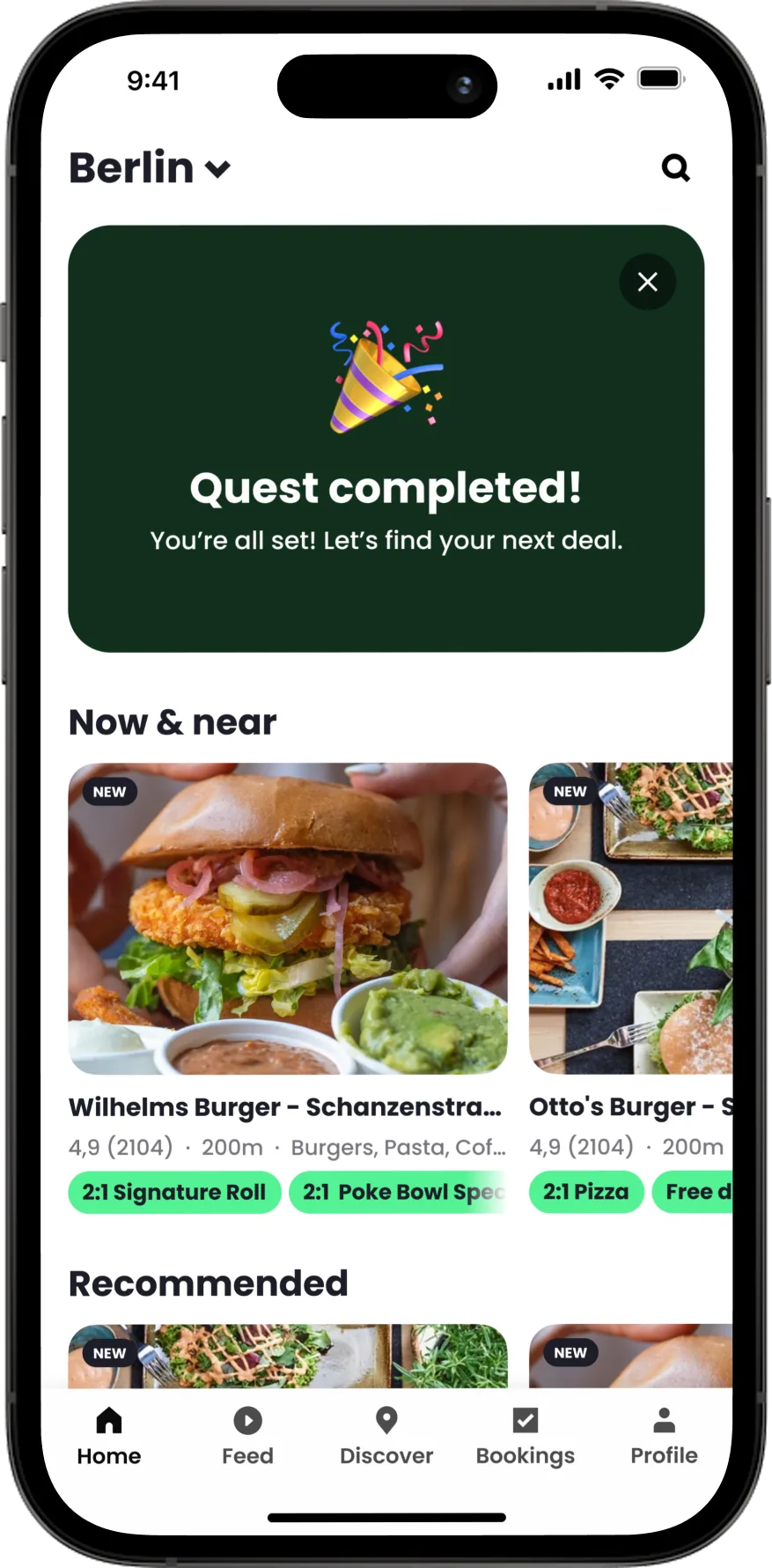
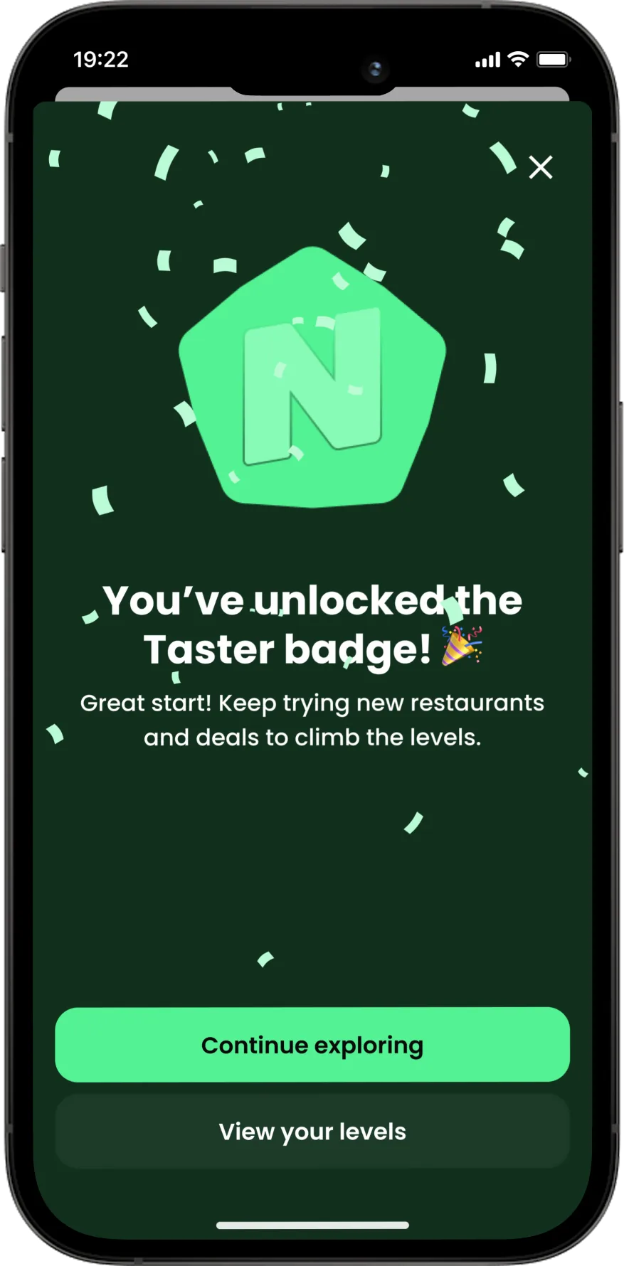 Celebration: confetti + Taster badge unlock
Full feature flow
Explore in Figma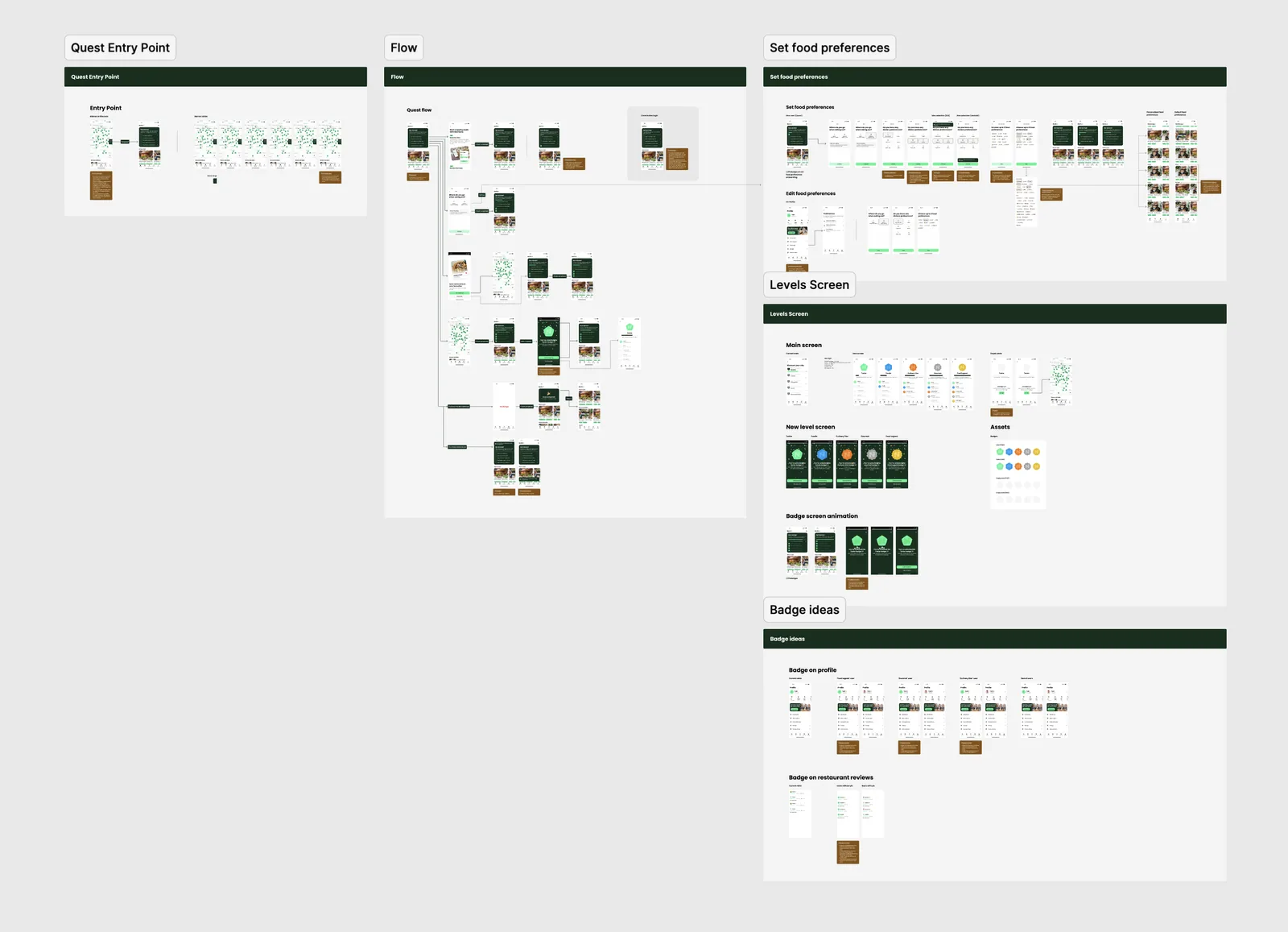
Key Design Decisions
Side quest 01: Food Preferences
One of the quest tasks prompts users to set their food preferences: where they like to eat, any dietary restrictions, and which cuisines they enjoy. The goal was to collect enough signal early to personalise their home feed and surface restaurant recommendations that actually matched their taste. A user who sees relevant deals from day one is far more likely to redeem one.
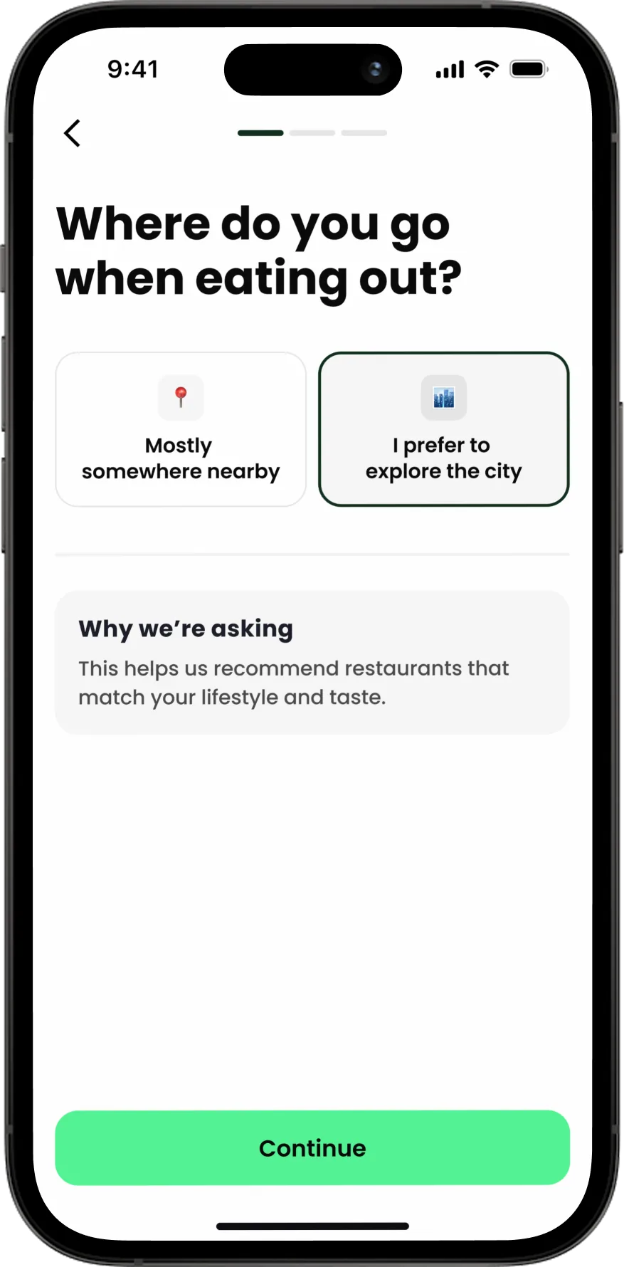 Step 1: eating location preference
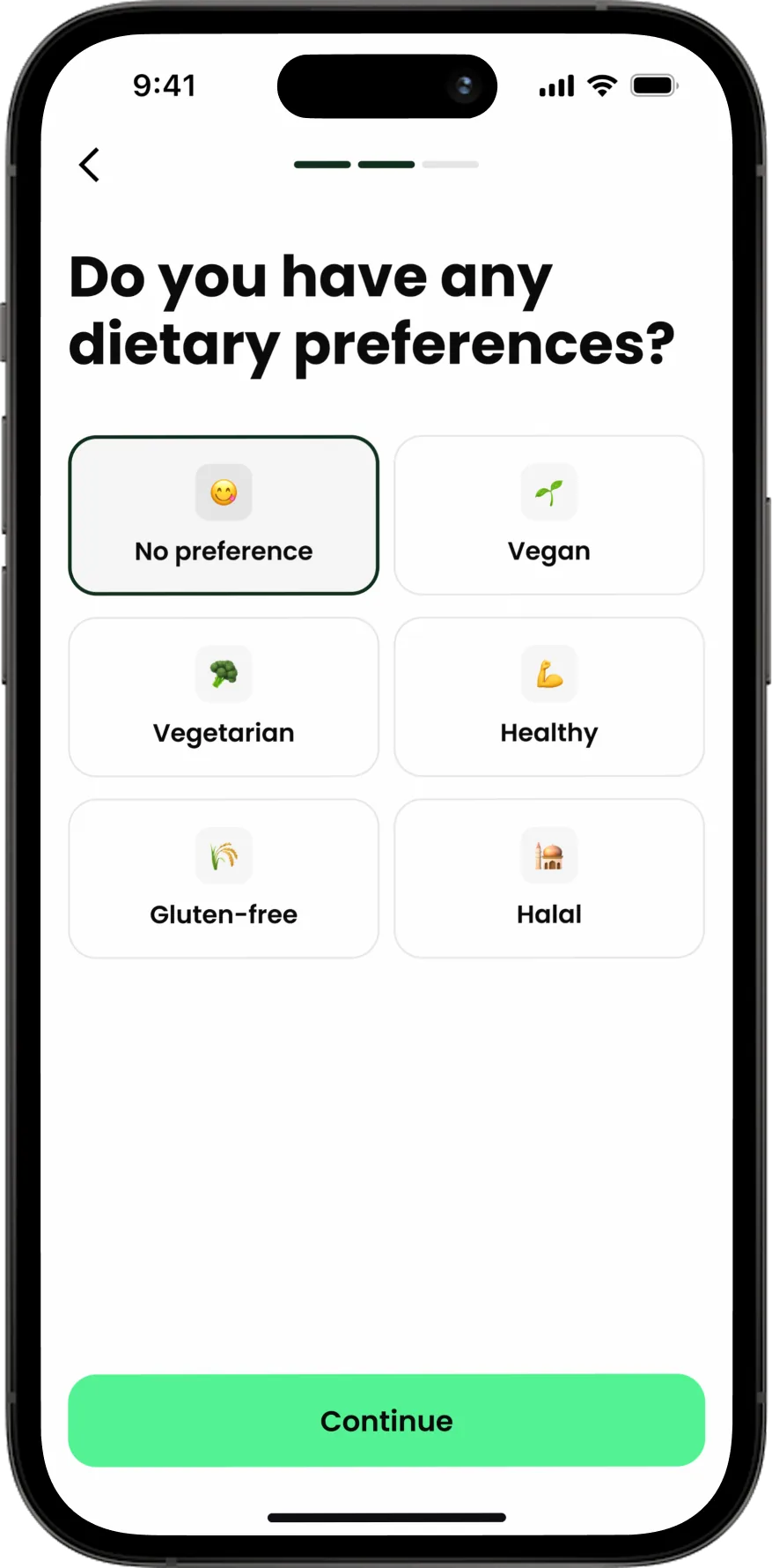 Step 2: dietary restrictions
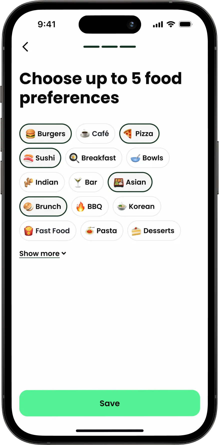 Step 3: food category selection
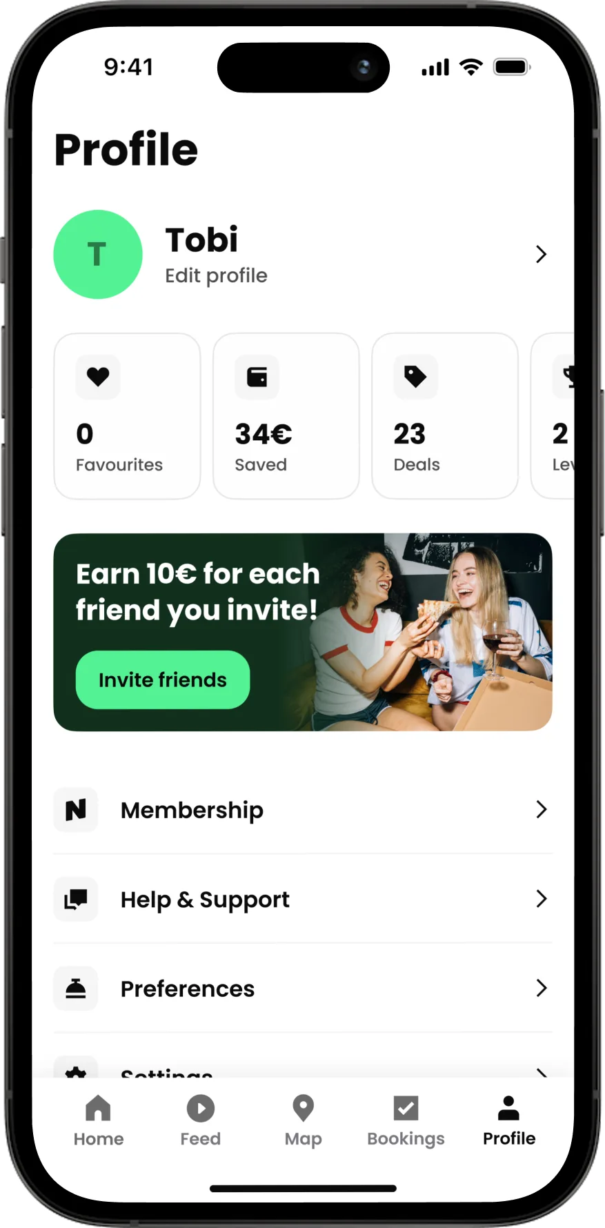 Profile: entry point to edit preferences
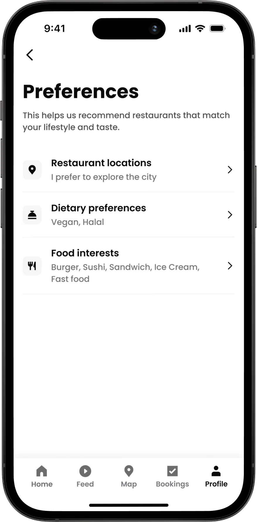 Edit view: update saved categories
Side quest 02: Levels Refresh
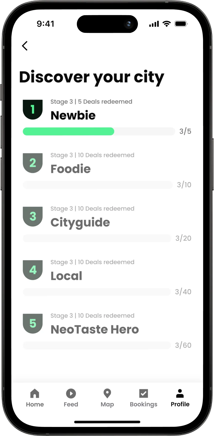
The Levels screen already existed, tied to deals redeemed, but almost nobody knew about it. By redesigning it with new level names, badges, and a celebration screen, we kept the gamification element where it actually made sense: as a reward for real actions, not app opens. The quest and the Levels refresh became one connected project.
 Before: original levels screen
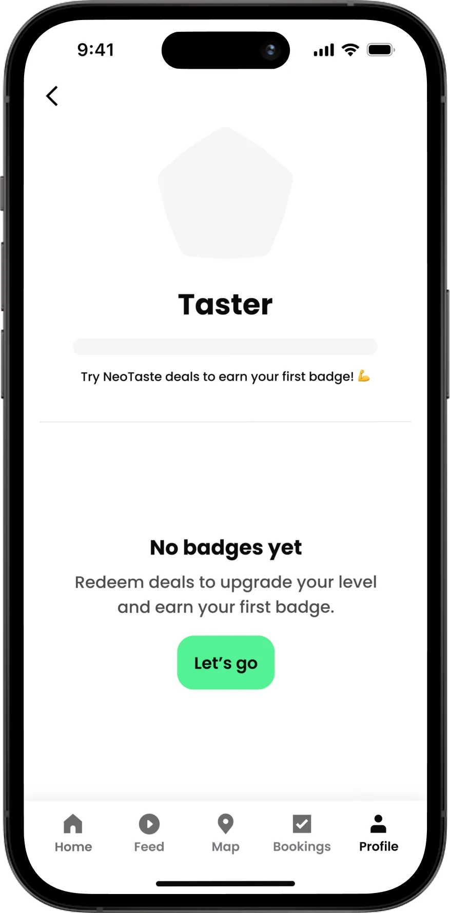 Levels screen: empty state, no deals redeemed yet
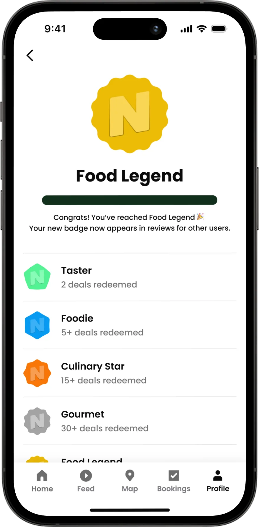 Levels screen: Food Legend, highest level (55 deals)
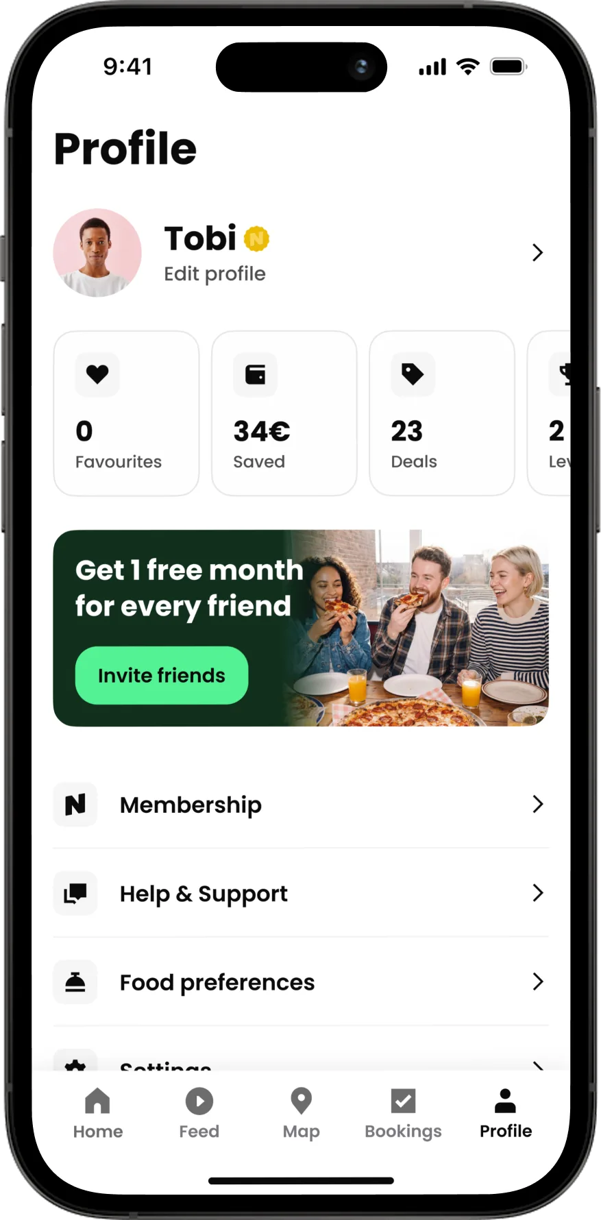 Profile screen: badge displayed after levelling up
Design system updates
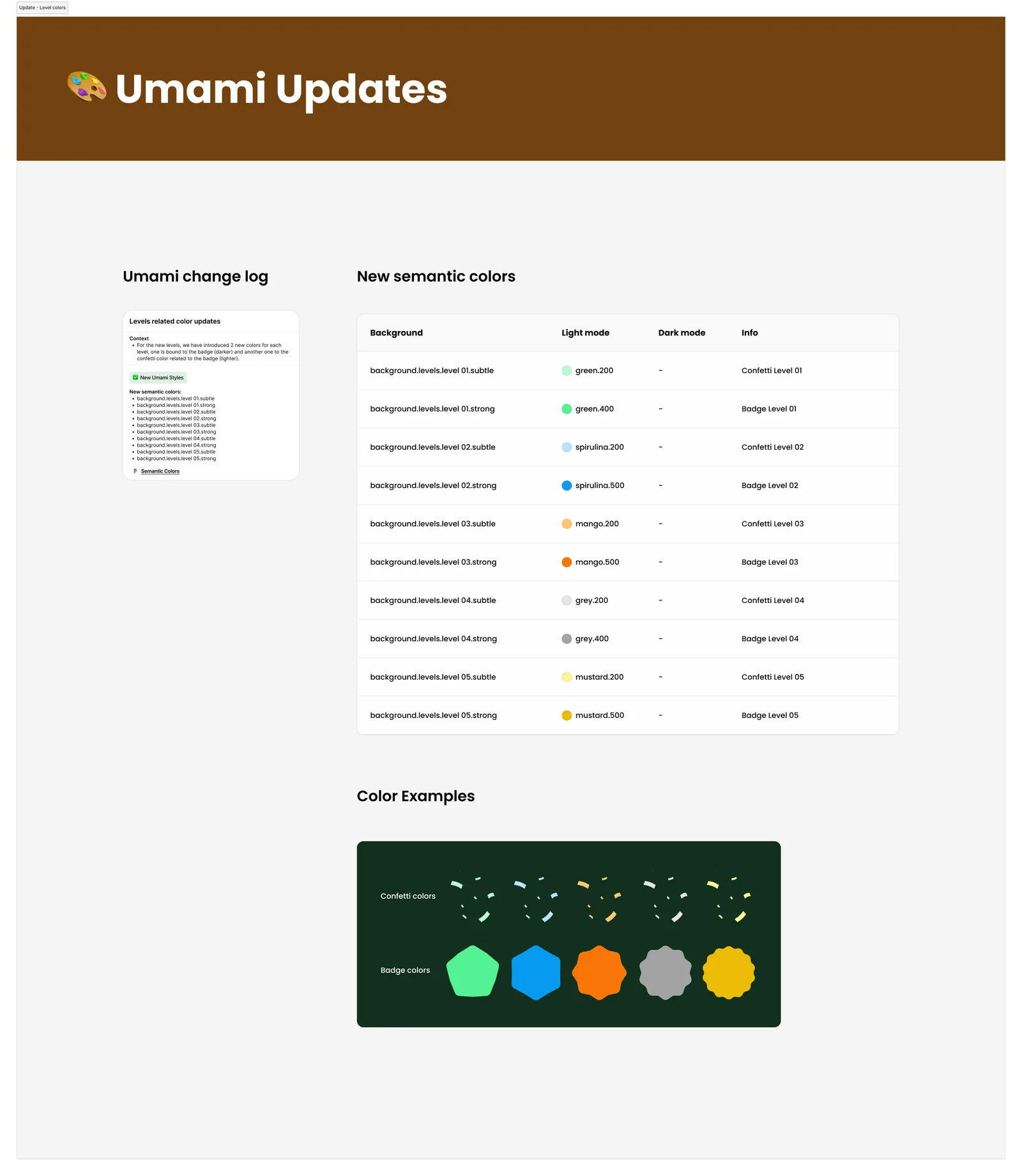
The Levels refresh meant new assets that needed to live in Umami, NeoTaste's component library. We added 10 new colour tokens: two per level (one for the badge, one lighter tone for the confetti animation), built to scale if new levels are introduced later.
Interactions
Implementation Plan
Two bets. Both paid off.
The Quest launched to 25% of new users, tested against a group that saw nothing. After 30 days, the results were clear.
The main goal was trial-to-paid conversion. The second bet was that better feature discovery would naturally lead to more deal redemptions during the trial. The numbers confirmed both.
Guide users early.
Users sometimes don't need more features. They need guidance. Once they've redeemed a couple of deals and seen the app work for them, they got it and they stayed. The quest was our way of making that happen without forcing anything.
Lessons Learned
What's next